How to Make Your Brand Look Luxurious and Original
In today’s society, one in which people read less and watch more, it is more important than ever to have an attractive brand potential clients can recognize anywhere. A consistent visual brand is key to attracting and keeping clients who love to interact with you.
In this post, we’re breaking down the key components of a visual brand, and how they can help you communicate luxury and originality.
Find Fonts that Evoke Elegance
Your written content is polished and informative, and now you need to make sure you pick the right font to show it off.
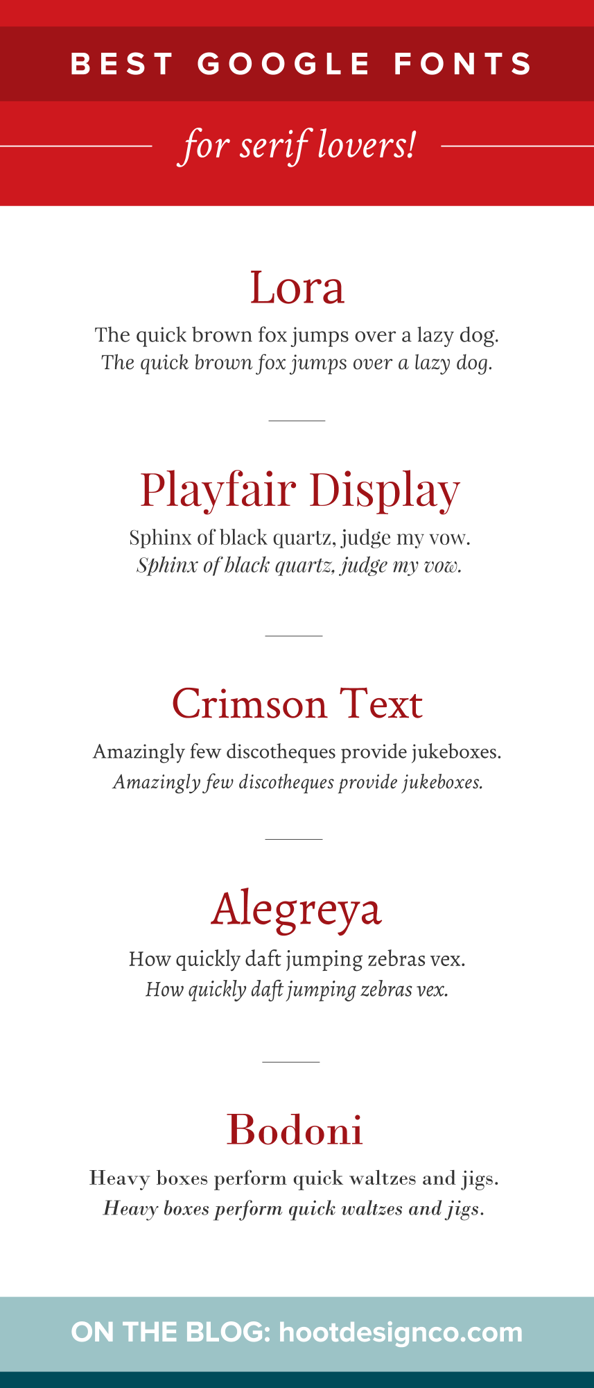
Serif fonts—fonts that have “feet” on the ends—give off a sense of luxury and sophistication. The best serif fonts feature subtle details and balanced proportions. A strong, bold serif font makes for a great headline, and more subtle serif fonts go well in body copy. Here are a few examples of serif fonts:
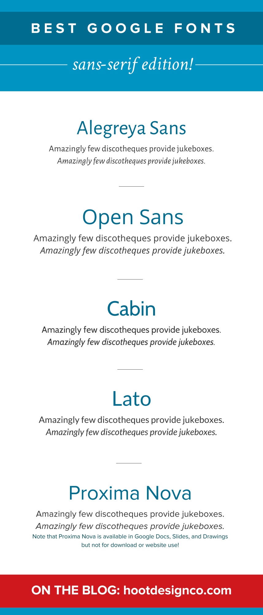
Sans serif fonts—the fonts without (hence, sans) the “feet”—can also be luxurious, but be careful with which fonts you choose. Heavier sans serif fonts are safer to use when conveying luxury. They are also a good choice for body copy, because they are very easy to read. Here are a few examples of luxurious sans serif fonts:
Script fonts—fonts that have a fluid stroke and can evoke a notion of personal touch—can be very decorative and radiate luxury, but it’s important not to overindulge in script fonts. This type of font can be used sparingly as an accent font, but never as body copy. Here are a few examples of script fonts:
Select Colors that Stand Out from the Crowd
Colors can be instantly recognizable and give your brand originality. Your potential clients will be able to pick you out from your competitors if you have a unique, consistent color palette.
Here are a few rules of thumb when choosing colors.

A combination of muted and bright or loud tones can convey luxury. The color contrast creates a harmonious balance but helps your draw in your client’s attention when necessary. For example, this vision board (to the right) balances light and dark colors and textures to create a sleek, luxurious visual brand that’s hard to ignore.
For luxurious brands, such as private clubs or resorts, it’s best to stick with one bright or saturated brand color, while the others help support this color and complement it well. For example, you can choose a particular shade of blue as your primary brand color, and use a warmer accent color such as red, orange, or pink to provide contrast.
Think twice about using loud and especially vibrant colors as your primary brand color. Cooler tones (such as blues, greens, purples, or grays) give off more of a professional, sophisticated feel. For luxury brands, keep the emphasis on these colors.
Use Photography that Clearly Represents Your Business
As the saying goes, “A picture is worth a thousand words.” But for brands, pictures can say millions. Photography is essential to keep your brand fresh and accessible to your dream clients.
Avoid photos that are clearly stock images (you know the ones), and use photos that represent your business. The models should look like the type of clients you want to attract, and the colors should complement your brand colors. Your photography should convey your brand goals and mission.
Make Your Mark with a Logo
When it comes to creating a logo, make sure it’s simple and reflects your brand.
Typographic logos—logos that utilize words more than images or design—are usually the way to go with luxurious brands. Your logo should have a clever typographic design unless you already have a specific symbol that represents your brand well.
Pick Patterns That Add Interest
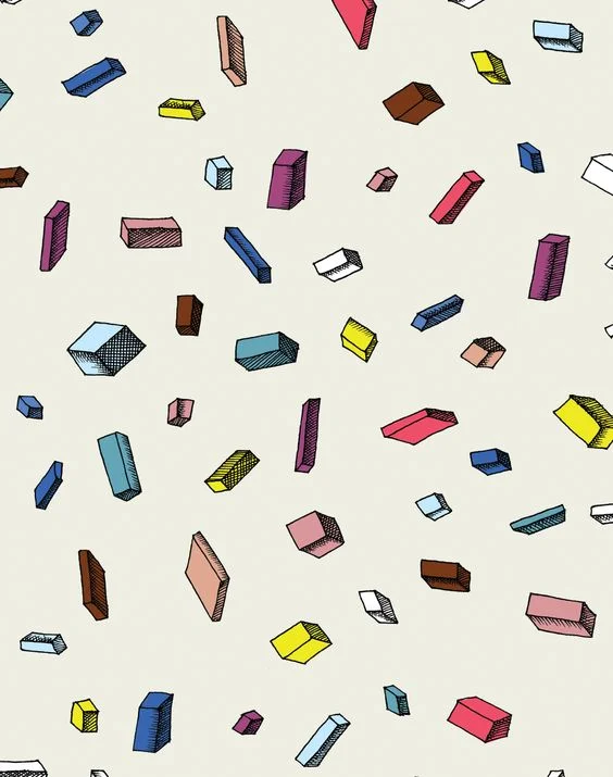
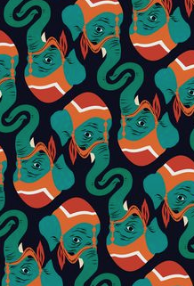
Patterns give your brand a rich texture and visual interest. Design is all about the details, and your clients will instantly recognize your promise of luxury and indulgence when you utilize patterns in your visual brand.
A combination of abstract and structured patterns make for an eye-catching visual brand. Abstract patterns are designs that balance shape, line, and color to create a cohesive design. Structured patterns are designs that repeat in the same way each time.
Here are examples of an abstract and structured pattern, respectively:
Make sure the patterns you use are reflective of your business. If you want to emulate elegance and simplicity, use more structured patterns. If you want to show off your modernity, abstract patterns might be the way to go.
Putting It All Together
When you have decided on your fonts, colors, photography, logo, and patterns, it’s time to put them together into one cohesive brand that spans across media. Make sure each aspect complements the others. Use this visual design on your website, print and digital materials, gifts, or any other medium through which you choose to interact with your clients.
Interested in creating your own visual brand? Check out our Brand Package to get started.

Hoot Design Co. is a marketing, branding, and design agency located in Columbia, MO. We specialize in creating a custom and comprehensive marketing strategy centered around your business's unique strengths and educating you with the tools you need from day one. From logo design to brand identity, website design and execution, and social media marketing strategies in-person and through online courses, we're focused on your business success every step of the way.