Best Google Fonts – Sans-Serifs that Make Great Headline AND Paragraph Fonts!
We’re about to be extremely straightforward with you guys: sans-serif fonts can be horribly boring – especially ones that need to be readable in a paragraph.
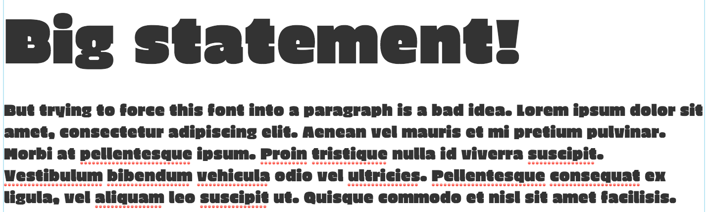
Big, bold, chunky headline fonts are lots of fun for one-liners or introductions, but are absolutely unsuited to being used in paragraphs. A font that makes a standout header can become dizzying when used in text-heavy situations.
One sporty yellow car in a parking lot filled with silver, black, and white is a magnet to your eye – so full of energy and excitement! But a whole parking lot filled with yellow cars...? It's nauseating, and pretty much defeats the point of having a unique, sporty yellow car in the first place.
Trying to force a standout headline font into paragraphs is the same way:
A font that looks exciting and attention-grabbing as a headline usually looks, um, ABSOLUTELY AWFUL when you put it into a paragraph.
And trust us, trying to find a unique sans-serif that can be a powerful headline AND readable paragraph choice can be a frustrating cluster.
But! There are a few go-to font families we wholeheartedly recommend for the task.
These sans-serif choices work equally well as paragraph or headline fonts, come in multiple weights, and have excellent italics. Oh, and they're all available for free use through Google.
Ready for the roundup?

Alegreya Sans

Alegreya Sans is a GREAT choice for text-heavy brands that are looking for a traditional, print-friendly touch in a sans-serif package.
BUT, while its angles are in line with a traditional, print-based style, Alegreya Sans is anything but boring. We absolutely love the unexpected angles and twists incorporated into this sans-serif. It's by far the most unique font in the bunch!
Like its serif counterpart (included in our best Google Fonts serif roundup!), Alegreya Sans is superbly readable, rhythmic, and welcoming, with fun italics and LOTS of weights.
Open Sans

Open Sans is a font of Google's own creation and perfectly embodies the friendliness, competence, and, yes, openness of Google's brand.
What makes Open Sans great is its impeccable readability on screens as well as in print. Plus, it has great italic and bold styles as well, and even comes in a condensed version, for a total of 13 styles. All in all, Open Sans is a great go-to sans serif support font for any casual, modern brand.
Cabin

Cabin is a great option for paragraphs and headlines with its balanced geometry and unexpected tails.
It's a WAY more readable and flexible alternative to popular fonts that are so geometric they're actually tough to read in paragraphs on either screen or print – think Raleway or Quicksand, for example, two fonts that are hampered by both their geometry and spacing in paragraph form.
Additionally, the Cabin family includes true italics (not just obliques, like Raleway and Quicksand) which makes it more versatile! Professional (but not stuffy!), dependable (but not boring!), and trustworthy – yep, Cabin has our wholehearted stamp of approval!
Lato
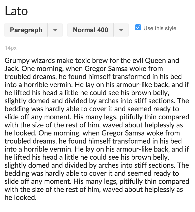
Lato seemed to pop up everywhere all at once: Lato has recently exploded all over popular brands, from Slack to Starbucks. It's a wonderfully versatile sans-serif that's easy to read and pleasantly casual thanks to its rounded endings.
Lato comes in 10 styles, from hairline-thin to ultra-bold – an attribute that greatly adds to its versatility and popularity! Add to this the fact that Lato's modern italics look great in all weights and it's little wonder Lato has found many homes all over the web.
Proxima Nova

Proxima Nova is truly a go-to: We use it here as our sans-serif webfont at Hoot!
Proxima Nova's tall x-height and robustly rounded curves makes it seem full (rather than sparse) and super easy to read on a screen.
However, Proxima Nova is a slightly puzzling case – it's available throughout Google Docs, Slides, and Drawings, but is not available for download or web use through Google Fonts. Weird. But we’re including it in this roundup nonetheless, because it's available on nearly every Google platform!
To sum it up, Google fonts is still awesome.
Google Fonts offers a ridiculously huge selection – there are more than 700 free font families available. And there are some great gems studded throughout – but dang is 700+ fonts a lot to sift through! These five fonts are total go-tos for both paragraphs and headlines. Thumbs up on that, eh?
PS: Google Docs, Slides, and Drawings are all great free resources that we make use of in Shape a Brand that Sells. It's amazing how you can craft a full brand without any design software at all – but you CAN, thanks to the huge variety and capabilities of resources like these!